Widget Reference
IronFlock boards are built from widgets. Each widget type serves a specific purpose — from displaying live data to capturing user input. Add any widget by dragging it from the widget panel onto your board canvas, then configure it through the settings panel.
Widgets fall into four groups: Data Visualization for charts and status displays, Content & Media for static and rich content, Input & Control for capturing input and sending commands, and Navigation for moving between board pages.
Data Visualization
Widgets that turn live and historical data into charts, gauges, and status displays.
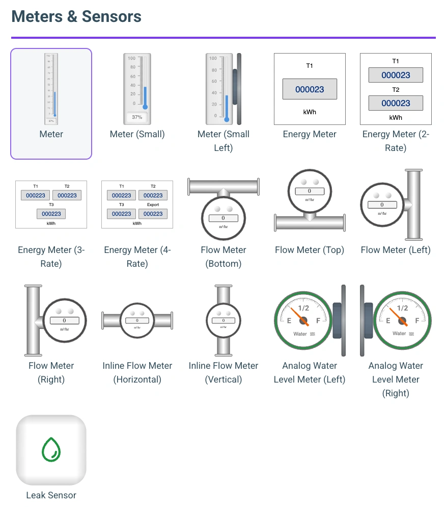
Cartesian Chart
Displays time-series or categorical data as line charts, bar charts, or a combination. Supports multiple data series on the same chart.
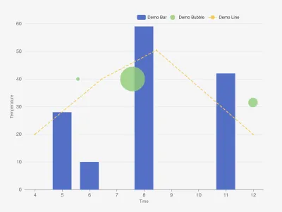
When to use: Trending sensor values over time, comparing multiple signals side by side, showing daily totals as bars.
What you configure:
- One or more data series, each pointing to a data column from your app
- Chart type per series: line, bar, or bubble
- X-axis type: time-based or categorical
- Y-axis label and time window (e.g. last 5 minutes aggregated by minute)
- Colors per series
Gauge
A radial gauge showing a single live value with colored threshold zones.
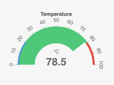
When to use: Temperature, pressure, fill level, or any value where you want at-a-glance status with green/yellow/red zones.
What you configure:
- The data column to read (always shows the most recent value)
- Unit and decimal precision
- Color zone boundaries (e.g. safe: 0–60, warning: 60–80, critical: 80–120)
- Optional: average the last N readings to smooth out noise
Value Display
Shows one or more single values with labels and units. Clean and minimal — great for KPI tiles.
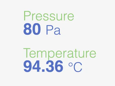
When to use: Showing current temperature, uptime, last event, or any key metric as a number.
What you configure:
- One or more data columns, each with a label and unit
- Decimal precision
- Text colors per value
Signal
Compact status indicators — circles or squares — that change color based on the current value, giving an at-a-glance status board.
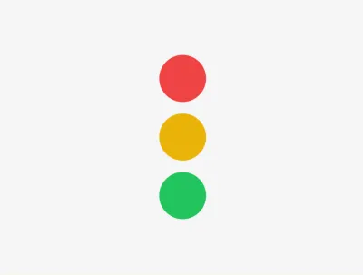
When to use: Device online/offline boards, OK/warning/error states across many assets, threshold-based status lights.
What you configure:
- One or more signals, each reading a data column
- Color mapping rules per signal: exact matches (e.g.
ONLINE) or numeric comparisons (e.g.>=70) - Layout (horizontal or vertical) and shape (circle or square)
- Optional title and subtitle
Doughnut Chart
A circular chart showing proportional segments.
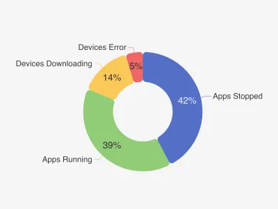
When to use: Showing distribution — e.g. devices online vs offline, share of production by product type.
What you configure:
- Segments, each with a label, color, and data column (or fixed value)
- Cutout size (controls inner hole diameter)
Table
Displays rows of data in a tabular format with configurable columns.
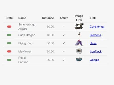
When to use: Showing a list of machines, recent events, inspection records, or any structured dataset.
What you configure:
- Columns, each with a header, data column, and display type
- Row height and header font size
- Number of rows to display
Column display types: plain text, number, state (maps values to colors), boolean, image, or button (clickable link).
Heatmap
A grid-based heatmap for visualizing intensity across two dimensions.
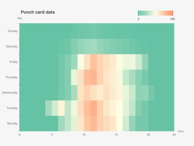
When to use: Energy consumption by hour and day of week, machine utilization per shift, anomaly patterns across time.
What you configure:
- X-axis (e.g. hour of day) and Y-axis (e.g. day of week) columns
- The value column for heat intensity
- Min/max scale and whether to use a continuous or stepped color gradient
State History
A horizontal timeline showing when states changed over time, one row per asset.
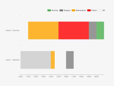
When to use: Machine status history (running / stopped / maintenance), shift logs, event timelines.
What you configure:
- State names and their colors (e.g. Running = green, Failure = red)
- The data columns for timestamp, state value, and asset name
Map
Displays geographic data on an interactive map. Supports circle markers and tracking lines.
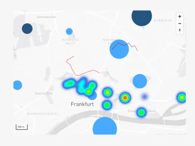
When to use: Showing device locations, vehicle tracking, field asset positions.
What you configure:
- Map style (light or dark)
- One or more series: circles (latest position markers) or lines (movement tracks)
- The data columns for latitude and longitude
- A pivot column to split data by device or asset
SCADA
Renders interactive industrial SVG symbols — pumps, valves, tanks, motors, pipes, gauges — from the ThingsBoard SCADA library, with live data bindings and state-based coloring.
When to use: Process diagrams and plant mimics — showing the live state of pumps, valves, tanks, and flows on a schematic.
What you configure:
- The symbol type to display
- Data bindings that drive the symbol’s state (running/stopped, open/closed, fluid levels)
- State colors (running, stopped, warning, critical) and other per-symbol styling
For building full process screens, see SCADA.
Content & Media
Widgets for static and rich content — images, formatted text, and embedded web pages.
Image
Displays a static image from a URL. Useful for logos, diagrams, or instructional graphics.
Image Overlay
Places live data values on top of a background image — great for floor plans, diagrams, or schematics.
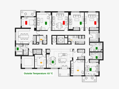
When to use: Overlaying temperatures onto a factory floor plan, showing fill levels on a tank diagram.
What you configure:
- Background image URL
- Overlay pins: progress bars or text labels positioned at relative coordinates on the image
- Data column for each pin (live value or fixed)
Markdown
Renders Markdown (CommonMark and GitHub Flavored Markdown) with syntax-highlighted code blocks and live variable interpolation.
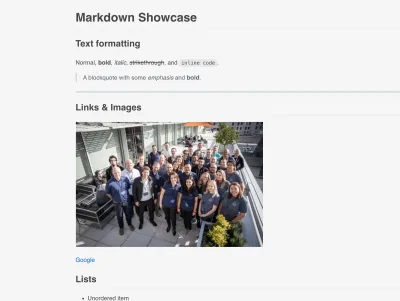
When to use: Documentation panels, instructions, or dynamic notes that mix formatted text with live data values.
What you configure:
- The Markdown source text
- Variables referenced in the text via
{{variableName}}, each bound to a data column or fixed value
Label
Displays a single configurable text label with full control over typography and alignment.
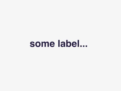
When to use: Section titles, captions, static annotations, or a single dynamic value rendered as text.
What you configure:
- The text to display (line breaks are preserved)
- Font size, color, weight, and style
- Horizontal and vertical alignment, and background color
Embed
Embeds external web content in an isolated iframe — a single page, or several arranged in a responsive grid.
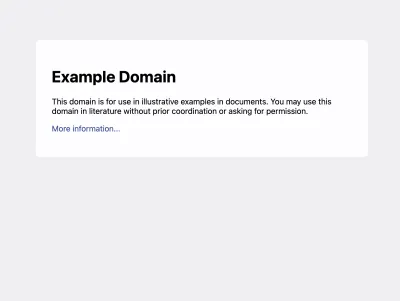
When to use: Integrating third-party dashboards, documentation, external tools, or any web-accessible page inside a board.
What you configure:
- The URL to embed (the target site must allow iframe embedding)
- An optional title shown above the content
- Multi-embed mode: multiple URLs arranged in a grid, with a configurable gap
Input & Control
Widgets that capture user input or send commands and filters back into the platform.
Form
A configurable data-entry form that writes user input back to your app’s data backend.
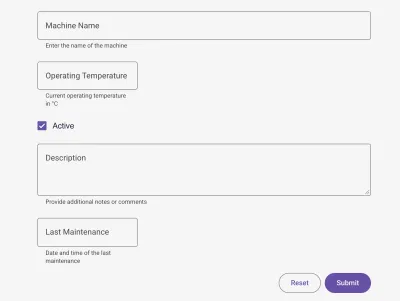
When to use: Manual data capture — inspection records, maintenance logs, operator input, parameter setpoints.
What you configure:
- Form fields of various types: text, number, checkbox, textarea, dropdown, date/time
- Per-field options: label, required, default value, validation, min/max, and target data column
- Optional title, subtitle, and whether the form opens in a dialog
Switch
One or more Material Design toggle switches that reflect a live value and trigger a device action when flipped.
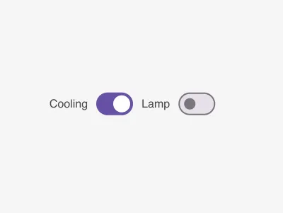
When to use: Turning equipment on/off, toggling binary device settings, sending control commands from the dashboard.
What you configure:
- One or more switches, each reading a data column
- State mapping for ON/OFF: exact values or numeric comparisons (e.g.
>50) - The target app, device, and action topic invoked on toggle
- Per-switch label and value colors
Filter Dropdown
A dropdown of predefined options that publishes the selected value as a filter parameter for other widgets to consume.
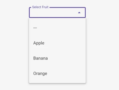
When to use: Letting users filter a whole board by device type, line, location, or any category.
What you configure:
- The label shown above the dropdown
- The parameter key other widgets reference in their data queries
- The list of options, each with a label and value
Filter Calendar
A date/time range picker — single date or range — that stores the selected timestamps as filter parameters for other widgets.
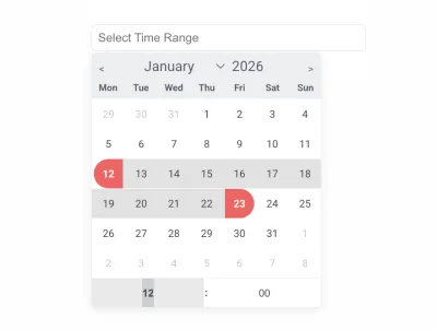
When to use: Time-series dashboards, historical analysis, and reports with a user-selectable time window.
What you configure:
- The start and end parameter keys (use one for single-date mode, both for a range)
- The number of months shown at once (1–3)
- The input label
Navigation
Widgets for moving between the pages and sections of a multi-page board.
Navbar
A horizontal top navigation bar with a clickable title or brand and multiple routed items.
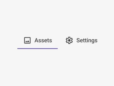
When to use: Top-level navigation across the pages of a multi-page board.
What you configure:
- The title/brand text and its destination route
- Navigation items, each with a label, Material icon, and route
- Font size, weight, and colors
- Dynamic route segments via
{{variable}}substitution
Nav Button
A single clickable button that routes to another page or performs browser-back navigation.
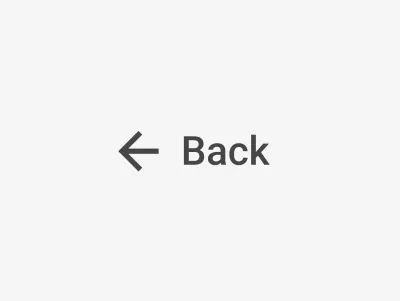
When to use: Back buttons, call-to-action links, or jumping to a specific board view.
What you configure:
- The button label and an optional Material icon
- The destination route (leave blank for automatic back navigation)
- Font size and colors
- Dynamic route segments via
{{variable}}substitution
Side Navigation
A vertical side menu with Material icons and route-based highlighting of the active item.
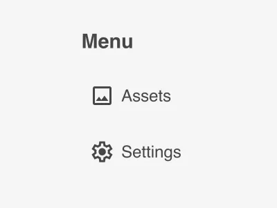
When to use: Persistent side navigation for dashboards with several sections or views.
What you configure:
- A title with an optional route
- Navigation items, each with a label, Material icon, and route
- Active-item highlighting based on the current route
- Font size, weight, and colors