Styling & Theming
Every board in IronFlock comes with a default look, but you have full control over its appearance. The dashboard style settings let you apply a theme, adjust the grid layout, and control how widgets look — all from a single settings panel. For individual widgets that need a different look, you can override the global style directly in the widget editor.
Themes
A theme sets the overall visual tone of your board in one click. IronFlock ships with a set of built-in themes — each one defines a coordinated palette of colors, backgrounds, and styling defaults that apply across the entire dashboard.
To apply a theme:
- Open the Board Settings panel (gear icon in the top toolbar).
- Go to the Theme section.
- Pick a theme from the list.
All widgets, backgrounds, and text colors update instantly to match the selected theme.
Themes are a starting point — not a locked-in choice. After picking a theme, you can override any individual setting (colors, borders, backgrounds) and those overrides take priority over the theme defaults.
Layout
The board canvas has several layout properties that control how widgets are positioned, how the canvas behaves at different screen sizes, and whether the board scrolls or scales. These properties work together to define the spatial behavior of your dashboard.
Grid Snap
When Grid Snap is enabled, widgets snap to the nearest grid cell when placed or moved. The grid divides the canvas into a matrix of rows and columns — widgets always align to cell boundaries, which keeps the layout structured and orderly.
When Grid Snap is disabled, widgets can be positioned freely anywhere on the canvas at pixel-level precision. This is the mode to use for SCADA-style layouts where symbols need to be placed at exact positions to match a process diagram, floor plan, or equipment schematic.
Grid Snap properties:
- Columns — The number of vertical divisions on the canvas. A higher column count gives finer horizontal positioning. A lower count snaps widgets to wider positions.
- Rows — The number of horizontal divisions. More rows means finer vertical control; fewer rows means coarser vertical snapping.
Tip: For SCADA boards using Grid Snap, configure a high number of rows and columns (e.g., 48×32 or more) to get fine-grained control over symbol placement while still benefiting from grid alignment.
Overflow X / Overflow Y
These properties control whether the canvas extends beyond the visible viewport.
- Overflow X — When enabled, the canvas can extend beyond the right edge of the screen. A horizontal scrollbar appears so users can scroll to content placed outside the initial viewport width. Widgets do not scale horizontally when the screen is resized.
- Overflow Y — When enabled, the canvas can extend beyond the bottom edge of the screen. A vertical scrollbar appears for content placed below the initial viewport height. Widgets do not scale vertically when the screen is resized.
Overflow works with both Grid Snap on and off. When overflow is active in a direction, the layout becomes non-responsive in that direction — widgets keep their size instead of stretching or shrinking with the window. This is useful for large SCADA diagrams, wide process flows, or tall equipment schematics where the full layout should not be compressed to fit the window.
When both overflows are disabled, widgets are constrained to the visible area and scale responsively with the screen.
Scale to Fit
Scale to Fit makes the entire board scale proportionally to fill the available screen space. You define a fixed aspect ratio for the canvas, and the board scales up or down to fit the browser window while preserving that ratio.
Scale to Fit properties:
- Aspect Ratio — The width-to-height ratio of the canvas (e.g., 16:9, 4:3, or a custom value). The board will always maintain this ratio regardless of the actual screen dimensions. Empty space (letterboxing) appears on the sides or top/bottom if the screen’s aspect ratio doesn’t match.
Scale to Fit works with both Grid Snap on and off. It is mutually exclusive with Overflow — when Scale to Fit is active, the canvas does not scroll because the entire layout is always visible.
This mode is ideal for:
- Control room displays — The dashboard fills any monitor cleanly without scrolling or distortion
- Kiosk screens — A fixed layout that adapts to different screen sizes automatically
- Presentation dashboards — Consistent appearance across laptops, projectors, and wall-mounted screens
Widget Fixed Size
Each widget has optional Fixed Width and Fixed Height properties that can be toggled individually. When activated, the widget will not resize in that direction when the screen is resized — it becomes unresponsive in that axis while the rest of the board layout remains fluid.
This is useful when certain elements need a stable size regardless of screen dimensions. For example, a navigation sidebar containing text labels should keep a fixed width so the text remains readable, even though the rest of the board scales responsively.
To set fixed size on a widget:
- Select the widget on the canvas.
- Open the Widget Editor.
- Enable Fixed Width and/or Fixed Height.
SCADA Symbols and Fixed Size
When SCADA symbols are placed on a board, they get both Fixed Width and Fixed Height activated by default. The highlighted icons in the widget toolbar indicate the active fixed-size constraints:
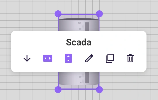
SCADA symbols represent physical equipment and process elements — they need to maintain their proportions and relative positions to accurately depict a real-world layout. In a responsive Grid Snap mode, this is only possible when symbol dimensions are fixed. Without fixed sizing, responsive rescaling would distort the symbols and shift them out of alignment.
See the SCADA Board Layout Options for an overview of how these layout modes apply to SCADA dashboards specifically.
Layout Modes Summary
| Mode | Grid Snap | Overflow | Scale to Fit | Behavior |
|---|---|---|---|---|
| Responsive grid | On | Off | Off | Widgets snap to grid cells; layout scales with the screen. Use Fixed Width/Height on individual widgets (e.g., SCADA symbols) to keep them stable |
| Non-responsive grid | On | On | Off | Widgets snap to grid cells but do not scale in the overflow direction; scroll to see the full layout |
| Scaled grid | On | Off | On | Widgets snap to grid cells; entire layout scales to fit a fixed aspect ratio |
| Scrollable canvas | Off | On | Off | Free positioning on an oversized canvas; scroll to see the full layout |
| Scaled canvas | Off | Off | On | Free positioning with a fixed aspect ratio; entire layout scales to fit the screen |
To configure layout properties:
- Open the Board Settings panel.
- Find the Layout section.
- Toggle Grid Snap and set rows/columns, or disable it and configure Overflow or Scale to Fit with your desired aspect ratio.
Global Widget Styling
Beyond the theme, you can fine-tune how all widgets look from the dashboard style settings. These settings apply globally — every widget on the board inherits them unless overridden individually.
What you can customize:
- Borders — Control the border width and color around widgets. Set them to zero for a borderless look, or make them prominent to visually separate widgets.
- Corner rounding — Adjust the border radius to go from sharp rectangular corners to fully rounded cards.
- Backgrounds — Set the widget background color or make widgets transparent to let the board background show through.
To set global widget styles:
- Open the Board Settings panel.
- Go to the Style section.
- Adjust borders, corner rounding, and background settings as needed.
These changes apply immediately across all widgets on the board.
Per-Widget Style Overrides
Sometimes a single widget needs to stand out — a status indicator with a colored background, a header card with no border, or a chart with extra padding. Instead of changing the global style, you can override it for that specific widget.
To override styles on a single widget:
- Click the widget on the canvas to select it.
- Open the Widget Editor (the widget’s settings panel).
- Find the style or appearance settings within the widget editor.
- Adjust borders, corner rounding, or background for that widget only.
The per-widget settings take priority over the global dashboard style. If you later change the global style or switch themes, widgets with overrides keep their custom look.
Tip: Use global styles to set a consistent baseline, then use per-widget overrides sparingly for elements that need special treatment.
Putting It Together
A typical styling workflow looks like this:
- Pick a theme that matches your project’s visual identity.
- Adjust the grid if you need more precise control over widget placement.
- Set global widget styles for borders, corners, and backgrounds to fine-tune the theme.
- Override individual widgets in the widget editor where specific elements need a different look.
This layered approach — theme → global styles → per-widget overrides — keeps your boards consistent while still giving you full flexibility where it matters.